Landing pages are an essential part of the user journey and have an important role to fulfill by stimulating a predetermined conversion. With consideration and investment, they can be the powerhouses of your content strategy.
What is a landing page?
The basic definition of a landing page is a dedicated page on a website that you land on directly from an external source such as a paid ad or email.
The landing page is the digital version of the direct marketing letter, highly targeted and focused on one specific outcome. The aim of the landing page is to stimulate a predetermined action using targeted copy to connect with a user and persuade them to act.
Landing pages can be constructed for SEO purposes to capture organic search traffic. They can also be used with paid advertising through search engines or social media.
The two channels of discovery to a landing page are:
Organic search: When a user finds the page from an organic SERP listing. Aside from delivering on the promise and intent of the query, the organic landing page must also make their brand and their offer clear.
Marketing campaign: These landing pages are usually accessed by a link from a paid ad or email. Traffic from paid ads has high commercial intent and is usually ready to complete an action. The page must be ready to fulfill that need and designed to funnel the user with all other options stripped away.
What is the difference between a landing page and a home page?
A home page is like the entrance to an airport. There are many check-in desks in the terminal building that are points of entry to channel you to the different gates and destinations.
Home pages are the portal to a destination.
Landing pages are the destination and all about conversion.
| Landing page | Home page |
| Is about the conversion of a predetermined action | Is about directing to another destination |
| Is specific and focused on one objective | Is about brand awareness and messaging |
| Has limited navigation options | Has multiple links and points of entry |
| Like a leaflet insert for a special offer | Like the front cover of a book |
| High commercial intent | Top of the funnel |
Can a home page be a landing page? Usually, no. There are always exceptions, such as a one-page website created specifically as a squeeze page to capture email or gain sign-ups. For a website that is more than four or five pages, the home page usually exists as the portal to enable a user to navigate to other pages.
The home page has too many functions to be focused on one landing page conversion.
Landing page examples (different types)
Squeeze pages, infomercial pages, viral landing pages, and splash pages are all types of pages considered to be landing pages. However, anding pages are more simply divided between a page that has a direct completion of form or sale on the page, or they lead to a direct action on another page.
The main two types of landing pages are:
- Lead generation landing page
- Clickthrough landing page
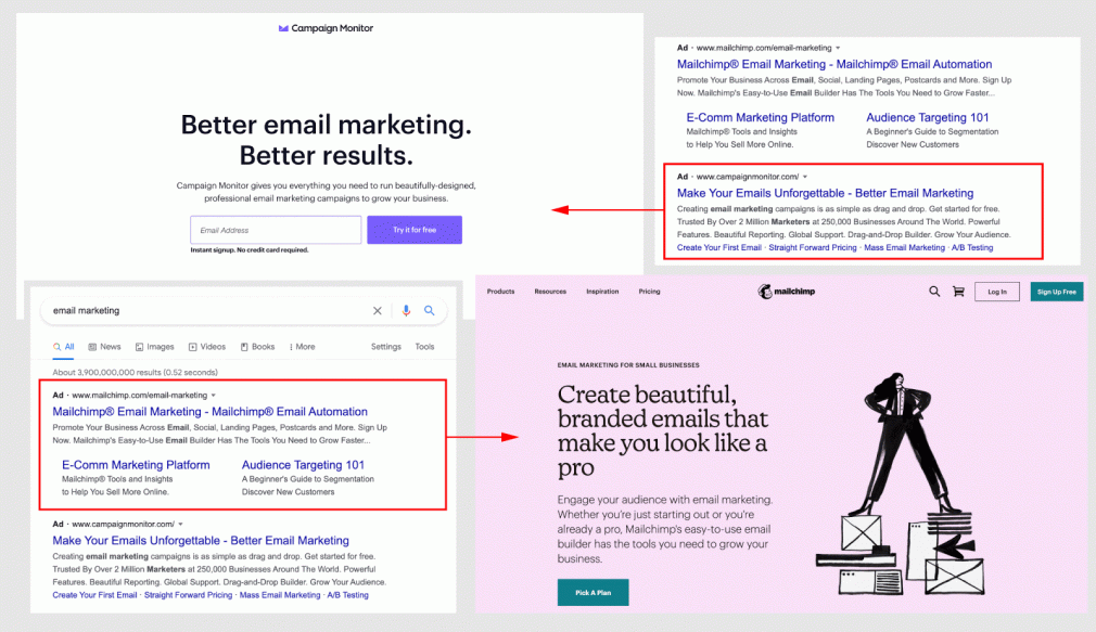
Below we have two email marketing companies and two types of landing pages. Campaign Monitor goes for the lead generation landing page and Mailchimp is a clickthrough.
The Lead generation page has a form on the page with the aim to capture an email address. This page can sit at the top (TOFU), middle (MOFU) or bottom of the funnel (BOFU) depending on where in the sales funnel your lead generation belongs.
TOFU Lead generation pages are used with free downloads and giveaways such as ebooks, whitepapers, access to webinars, or a free ‘teaser’ piece of content that has value. Ecommerce companies use discounts and special offers as an incentive for email capture.
The email capture is followed up with a series of email communications to establish a direct relationship and nurture the lead over time.
BOFU lead generation pages simply capture Sales Qualified Leads (SQL) for the sales team to close. These can also be used with access to webinars and content downloads, and for free service trials from SaaS companies.
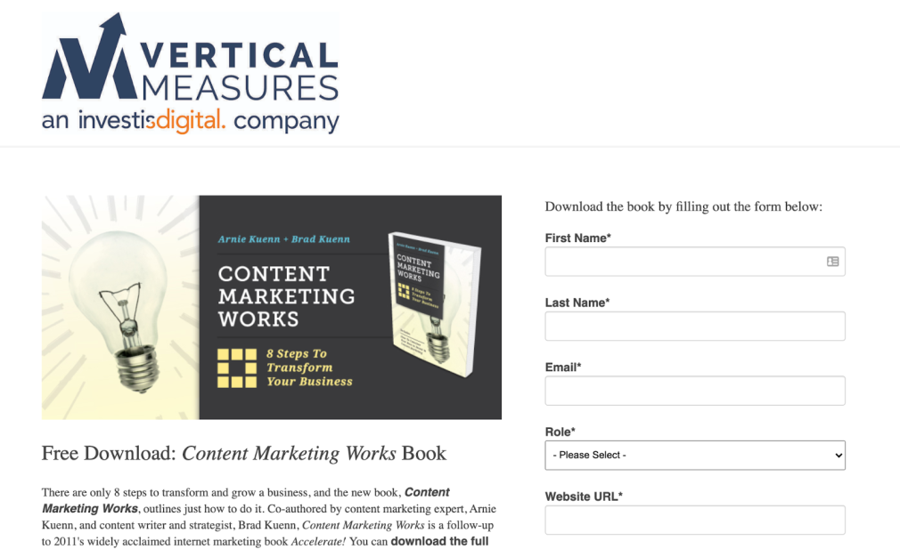
Below is a TOFU landing page for ebook download. The page leans towards a classic style of design, but it does tick the box of having the sign-up form above the fold and includes social proof testimonials further down the page.
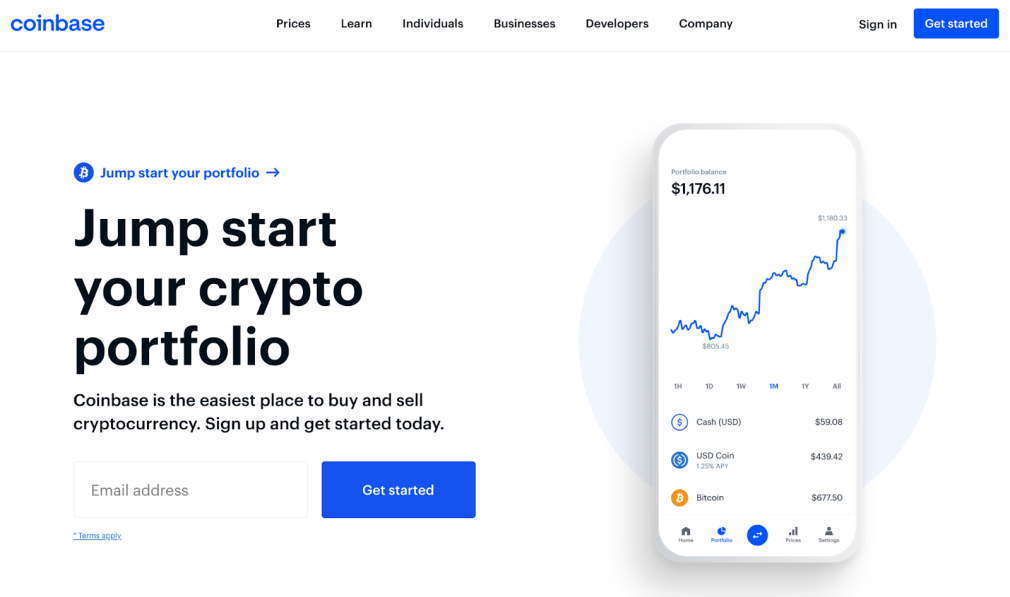
Coinbase has a stylish and focused lead generation page that gets to the point. A clear message and unique proposition with a simple email capture form. Highly effective.
The Clickthrough landing page has a button(s) to direct the user to the next action. The clickthrough page will employ persuasion and can be served with dynamic personalized content.
The next page is usually the shopping cart page, sales page, or price plan page for the product.
SaaS companies can use a clickthrough page to sell the benefits of the service before they direct you to the pricing plan page to make a selection.
High-ticket items such as a Peleton bike use the page to show you how the product works, a selection of products, and the social proof of satisfied customers before clicking to the product page to checkout.
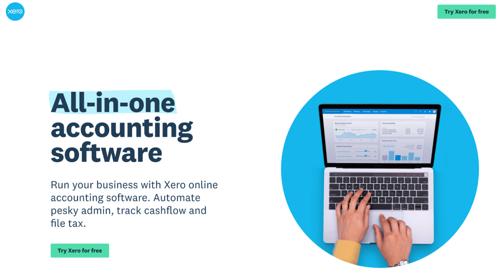
Xero has the same minimalist and stylish design as Coinbase but opt for a clickthrough page that directs you to the paid plan page where you can make your selection.
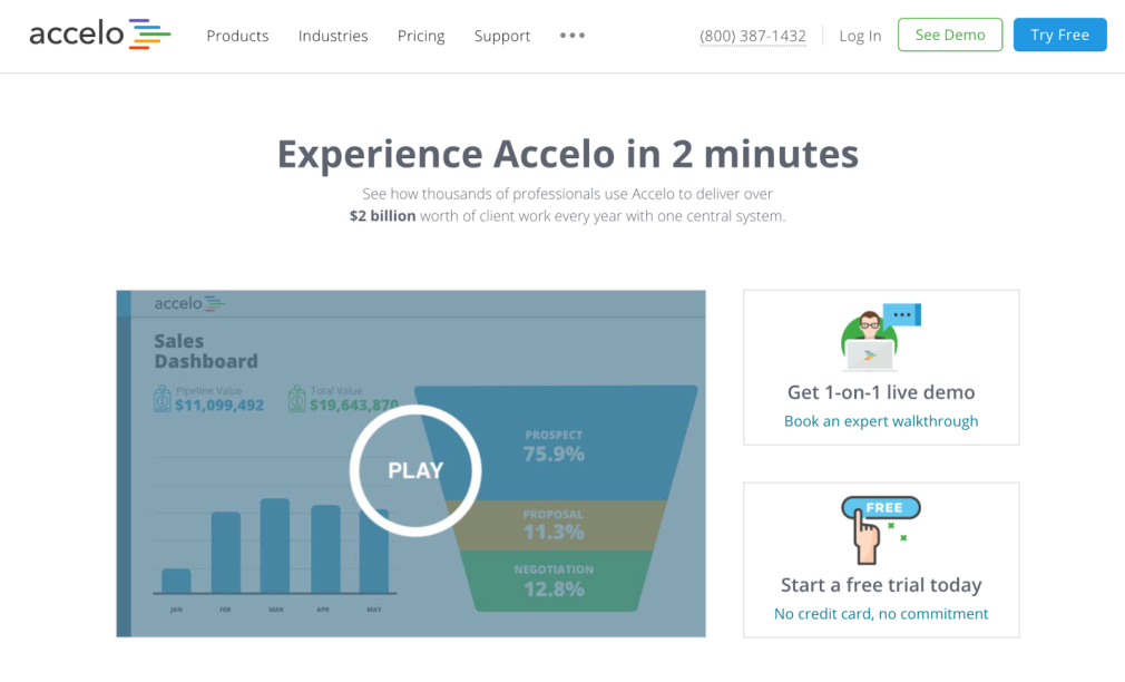
Accelo uses an intro video to engage the user and then guides them to either a demo or a free trial.
British Airways might look like a lead generation page at first glance. It’s actually a clickthrough page that guides you to find a flight before going to the price plan page and then checkout.
Dynamic landing pages
Much like email marketing, a dynamic page can be coded to serve personalized content in certain fields. Research shows that personalized CTAs perform 202% better than a basic CTA, so utilizing dynamic content on your page can have a considerable impact.
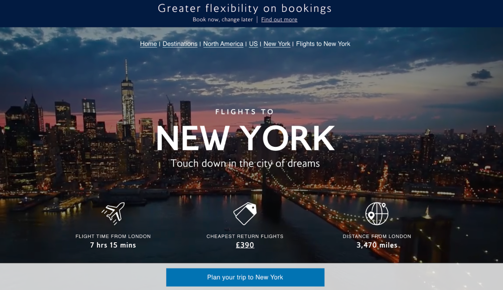
Different images, headlines, or words can be inserted through the page dependent on the user or their location. This is especially useful in locally targeted content and travel companies.
The mantra of direct marketing is test, test, and test again. Landing pages are perfect for tracking and for split-testing different variations.
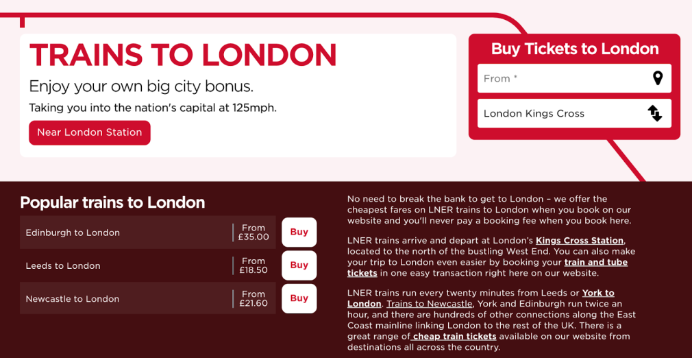
The LNER page is an example of not needing a hero image to be effective. A strong headline combined with the option to select tickets is a seamless process that will move you quickly into the sales funnel. The strong red (train) line moves your eye to the CTA box – this is a great example of effective design.
How to create a landing page
As highlighted at the start of this article, failing to deliver on the promise from ad to page is a waste of your budget and the user’s time.
A landing page should be approached as a standalone page rather than another page on your website. Ideally, you will have reduced navigation and reduced options to take your attention away from the desired action.
Before you start to create a landing page, consider your end goals for the page.
4 questions to ask before you start your landing page:
- How are you going to drive visitors to the page?
- Who is going to visit the page?
- What do you want your visitors to do?
- Does the page deliver on its promise?
If you spend money on paid ads, you want to ensure that when the user lands on the destination you offer the best chance of benefiting from that click. Don’t waste the opportunity.
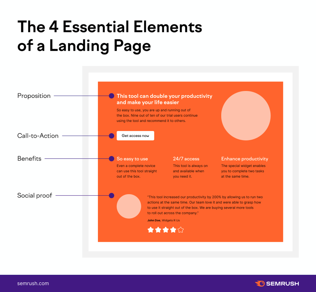
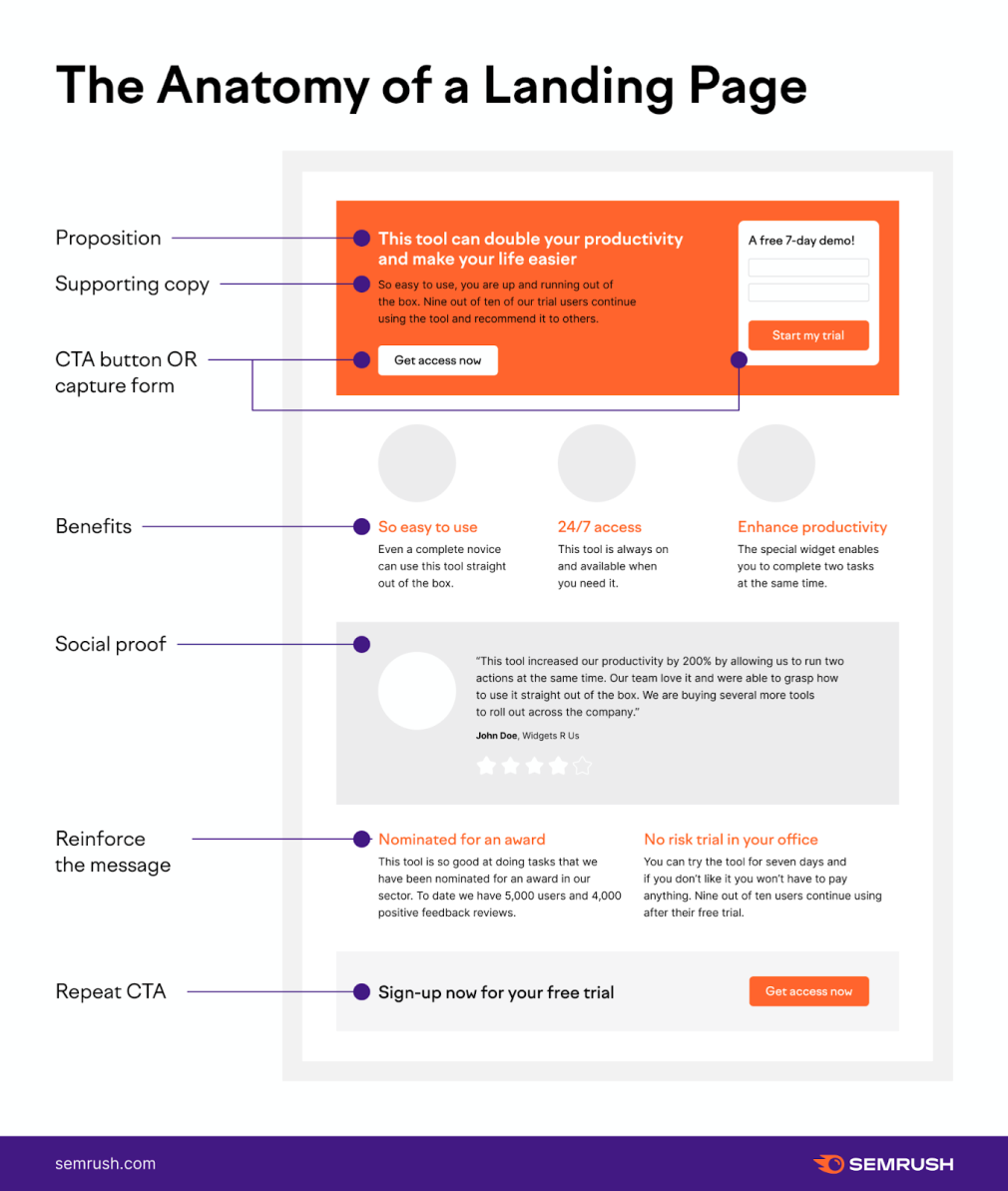
The 4 essential elements of a landing page:
- A unique proposition: what makes your offer so appealing and enticing? Why should the user take action? Use the proposition in the headline to gain attention and encourage the user to read the supporting copy. Use all best practices of writing a great headline and persuasion copywriting.
- Call to Action (CTA): possibly the most important part of the page! Make your CTA button obvious and stand out. Include a CTA above the fold and repeat at the bottom of the page.
- Benefits of the offer: don’t sell features, sell benefits. The user doesn’t care if the product is green or red. The user cares about how it will make them feel.
- Social proof: word of mouth and social approval offers trust and this will sell more products and services than anything else. People do not like to take risks. Seeing that others have a positive experience offers credibility and instills confidence that the product will meet their needs.
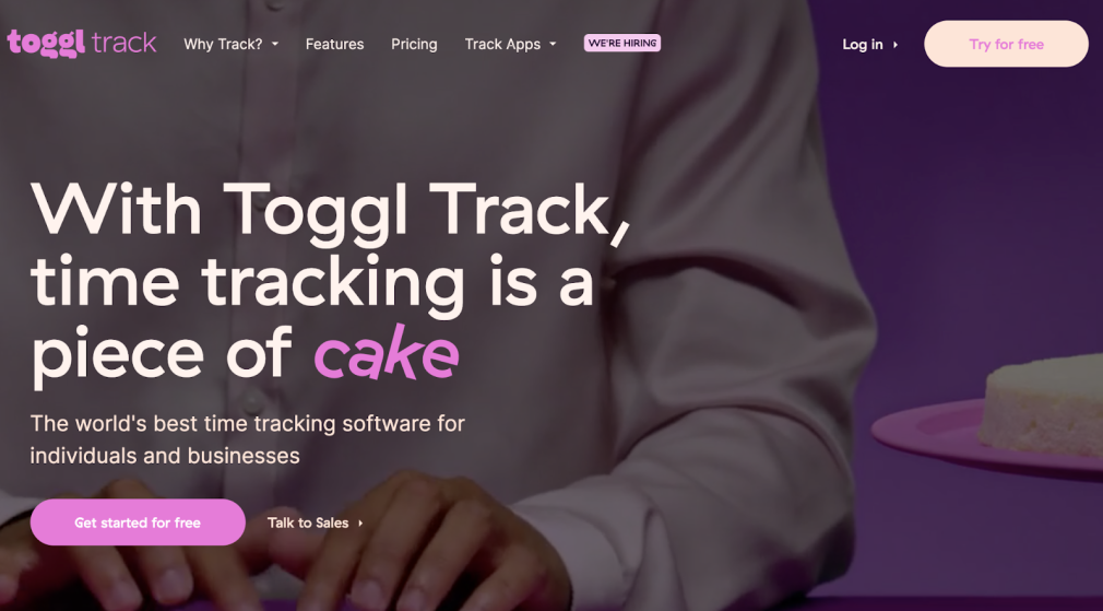
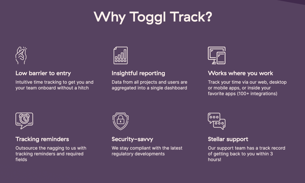
Toggl has a compelling proposition that grabs your attention on their landing page.
If you half close your eyes and look at the image, what stands out the most?
The visual hierarchy on the page is well-balanced. The headline and the CTA button being the most prominent element on the page.
If you keep scrolling down the Toggl landing page, they outline their benefits.
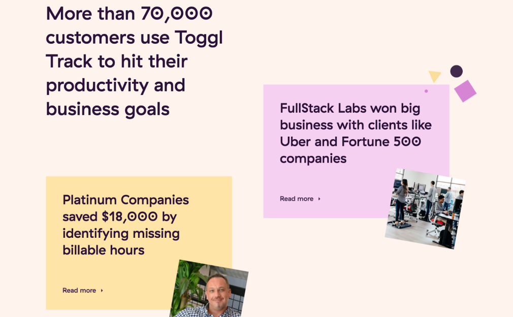
Further down the page is the social proof. Customer count feeds herd mentality buy-in and a selection of benefits experienced by companies using the tool underlines Toggl’s credibility.
When creating landing pages, Semrush can help in two ways. Use the Content Template Tool to structure better organic landing pages and work with the Advertising Research Tool to find ideas for landing pages.
Creating organic landing pages
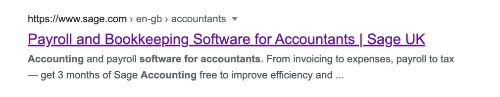
If we look in the SERP at the term ‘accounting software for accountants’, Sage holds the top organic result with a focused meta title directly referencing the query.
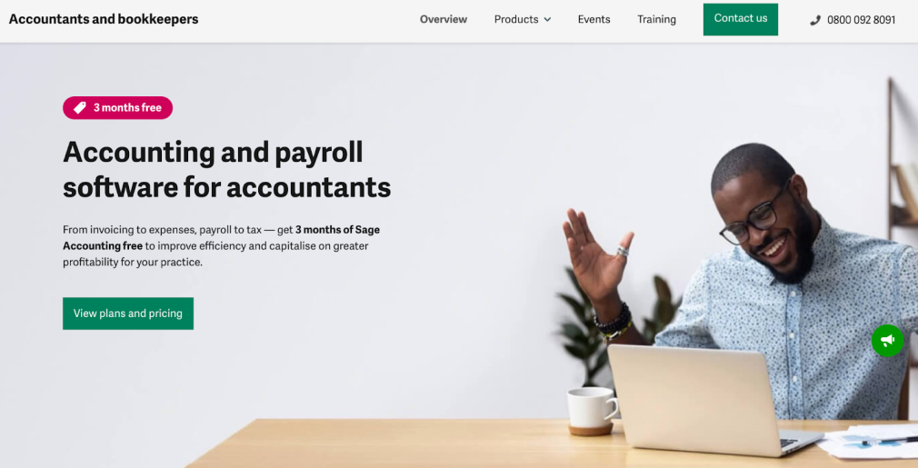
The headline on the clickthrough landing page echoes the title for a seamless experience.
To help create a page that will target a keyword to deliver organic traffic, you can use the Semrush Content Template. The tool can make suggestions for semantically related keywords to include on the page and suggest domains to target for backlinks.
Finding ideas for landing pages from your competitors
If we take Intuit (QuickBooks) as a direct competitor to Sage, we can drop their domain into the Advertising Research Tool.
Navigate to the Ad History tab. Taking inspiration from the query ‘accounting software for accountants’ we can search for variations on this theme to find different niche opportunities.
Start with the term ‘accounting software’ and then add a relevant modifier such as ‘accounting software for’ to see the wildcard options.
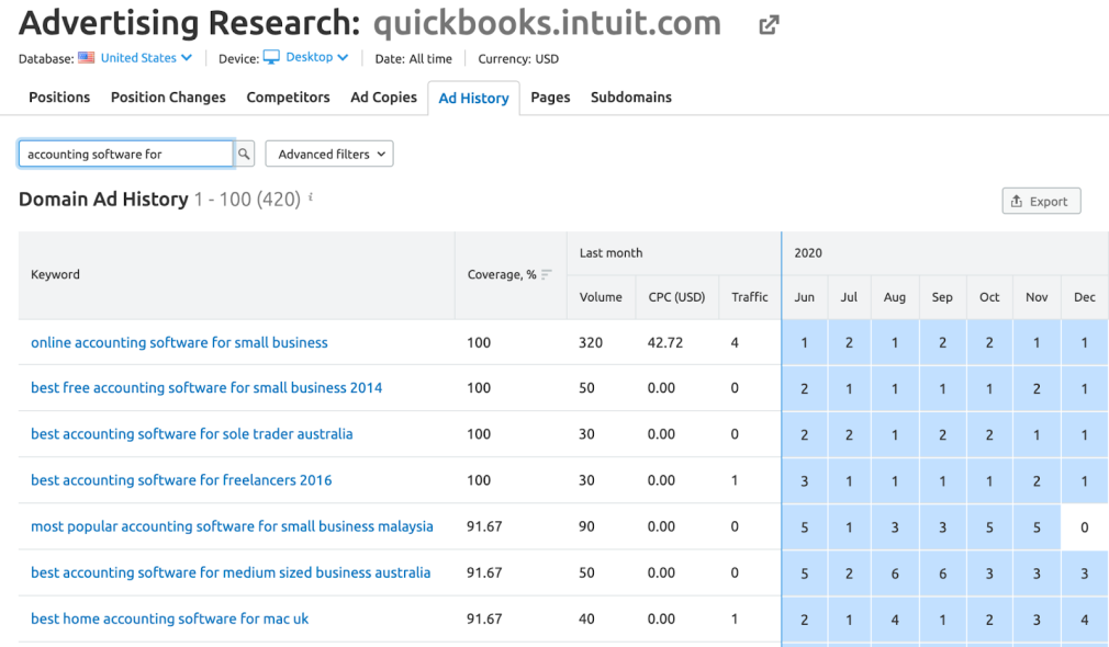
For individual keywords, you can view the ads that Intuit are running.
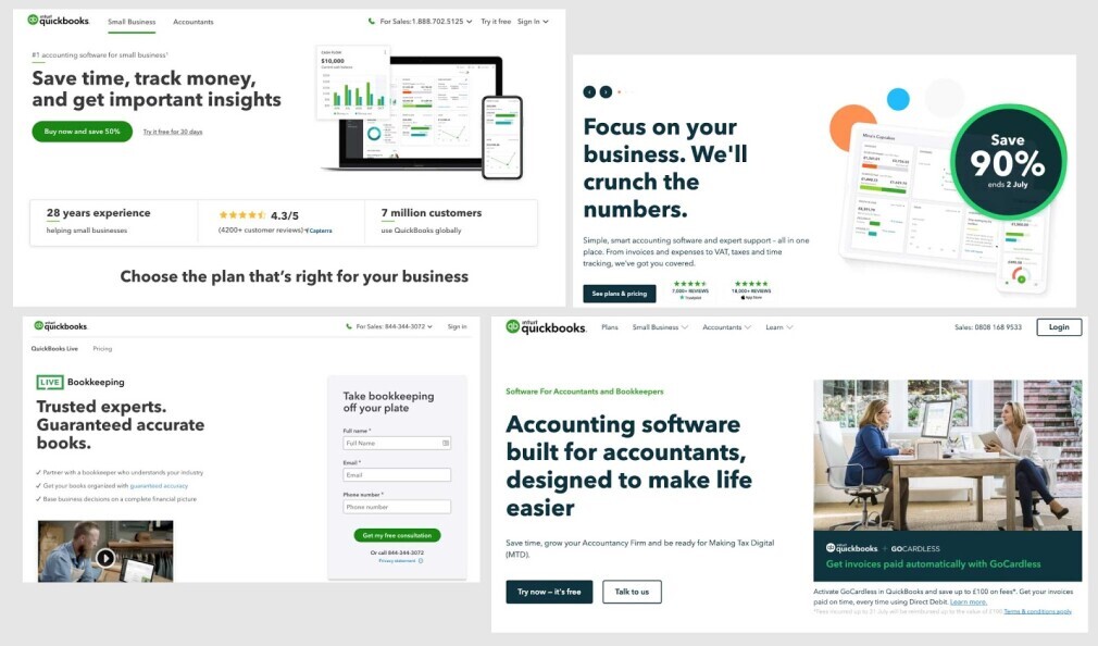
If we click on the ads, we can see the variety of landing pages that Intuit has constructed and are testing for ‘online accounting software for small businesses’. We can also see the offers and incentives that can help to inform our own marketing strategy.
By deconstructing their landing pages, we can consider our own landing page strategy and message for similar markets.
Landing page best practices, to make sure your page can achieve the best conversion rate:
Target your page to a specific CTA Pages that have more than five links have an average conversion rate of 10.50% compared to 13.50% for pages with one link.
Have one action that you want a user to complete and don’t try to confuse or dilute what you want from the page. Avoid offering different CTAs or links to other pages other than where you want the user to go.
Don’t make your user think.
Position the offer above the fold and make it instantly understandable
As soon as a user lands on the page, it should be absolutely clear and obvious what the offer is and what they should do next. A page that is vague or disconnected from the ad that it came from is the most frustrating experience and users will not hang around to figure it out.
Remember that users don’t read online in a traditional way; they skim copy looking for prominent keywords and phrases they recognize. Position your offer and benefits in your headlines and subheadings to get attention.
Avoid anything that distracts away from the CTA
The aim of the page is to get the user to complete your predetermined action. Avoid having anything else on the page that might take attention away from this action. Every element placed on the page should support the CTA goal.
The CTA should be the most visually prominent element on the page. Color, size or using the weight of space around the button will draw attention to it and make sure it stands out.
Repeat the CTA on the page
The first CTA should be above the fold, so it can be seen as soon as the user drops on the page. If you have a scrolling page, always repeat your CTA at the end – never leave a user without somewhere to go.
Remove the usual navigation options and have a limited version
A user should be able to determine who the brand is and what they sell as soon as they land on the page.
However, you don’t want to present them with too many options to navigate around the main site. As above, keep their attention focused on clicking the CTA button and reduce the potential to click on another link.
Segment your personas and target one per landing page
Any marketing you do should be created with your target audience front and center. Even more so for a landing page. Dynamic landing pages can be created to target different demographics on the same topic. You can also create different pages for the different sales funnel of personas.
The more landing pages you have, the more your conversion rates will increase. Companies that have more than 10 landing pages see a 55% increase in leads. 40 or more pages see an exponential increase.
This highlights that the more pages you produce, the more targeted you can be with your targeting and messaging.
The landing page should load in 5 seconds, or the conversion rate starts to fall
Core Web Vitals brought home the importance of a fast-loading webpage, but landing pages are even more critical. Every second a page loads is more money taken off the table.
After 5 seconds, just 1 more second is a 4.42% reduction in conversion and keeps dropping by 2.11% for every second after that.
Include social proof to help the user justify their decision
As mentioned above, buyers are swayed by social endorsement to avoid making a mistake or being considered social outcasts.
Landing pages with social proof convert at an average rate of 12.50% – compared to 11.40% for pages without proof. 1.1% might not sound like a big uplift but 1% increments in conversion rates combine to make substantial differences.
Group opinion is a powerful persuader. Most people want to be convinced to buy a product. Emotionally they want an expensive exercise bike, but they just need you to justify the decision for them. If everyone else has bought one, that effectively gives them permission to do the same.
Invest in the User Experience (UX) to squeeze out every last conversion
Conversion optimization can make a huge difference to the conversion rate on pages. Start out by following best practices for the anatomy of landing pages (see below). And then test your own variations.
Test and iterate every part of the page
Test everything. Test the color of CTA buttons. Test the message in the button. Test button placement.
A/B testing has never been easier (imagine how they did it with direct mailing). We have instant feedback on performance and can leverage that to tweak our page until it’s a conversion machine.
Netflix and Amazon both built the stratospheric success of their companies by constantly testing and iterating their product until they dominated their relevant sectors by wiping out all competitors.
Source: https://www.semrush.com/blog/what-is-a-landing-page/